No, we aren't talking about the latest trend in technology or fashion; we're talking about trend analysis for time series data! Disappointed? Don't be, this is an exciting and fun topic.
Put simply, trending is the practice of fitting a curve (e.g. line, polynomial, exponential, etc.) to your data over time, in an effort to project a forecast and establish a confidence interval.
How does this relate to time series analysis? While the fitting curve is a function of time, the parameters' values of the curve are calibrated (or fitted) using the prior information and are thus related.
Why should we care?
The trend in Excel is very often used (or abused) in the industry to make a quick (and dirty) forecast. Executives might use the trending tool as a sanity check when he/she examines results from more advanced models.
In this paper, we will go over the trend in Excel's “NxTrend” built-in function that was first introduced in NumXL 1.55 (LYNX) and demonstrate, through numerous examples, its use and the intuition behind it. We will focus on the backtesting aspect and the forecast confidence interval.
Background
Microsoft Excel comes with a native “Trend” function, but it is limited to linear trends and does not generate outputs other than the fitted value. The NxTrend function pushes the trend application from a nice line on a graph to a comprehensive trend analysis.
NxTrend supports five (5) different curve functions:
$$\begin{cases} \text{Linear} & a + b \times t \\ \text{Polynomial} & a + b_1 t+ b_2 t^2 + b_3 t^3 + \cdots + b_q t^q \\ \text{Exponential} & a \times e^{b \times t} \\ \text{Logarithm} & a + b \times \ln{t} \\ \text{Power} & a \times t^b \end{cases} $$
Each of the trend in Excel functions supports a fixed (i.e. known) intercept or float (i.e. computed by the fitting algorithm). Also, the power and the exponential curve functions require the values of the sample time series to be positive.
Problem:
In practice, we have a data sample taken over a period of time. We try to fit a parametric curve between the points in such a way that it describes the data well and, once satisfied, we will extend the curve beyond the end of the sample, forecasting for future data points.
Interesting? Let’s look at a sales data sample and use the Excel trend feature in graphs:
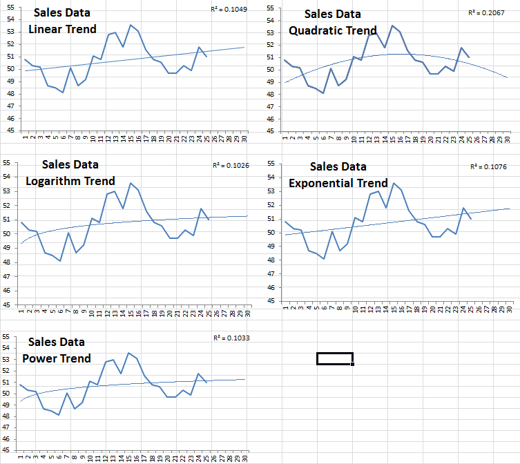
Comparing the five different curves, the quadratic has the highest R-squared but is projecting sales to drop after month 25 That being said, we can say definitively that we will prefer one of the four other possibilities; but which one should you choose?
Furthermore, a forecast usually comes in as an interval – upper and lower limits – with some probability measure for this range. How can we do that with a trendy curve?
Solution:
As a data or forecast analyst practitioner, you know that forecasting is not a one-time thing: you need to periodically update your forecast as new data is realized. That being said, how would our trend function fair over time?
The description above is often referred to as “backtesting.” For our purposes here, we want to back-test the trend function.
- Let’s set the time backward to the beginning of the sample data plus 2 (accrue a few observations):
- Run the trend function using the prior data.
- Forecast the present value and its confidence interval – remember that we moved back time.
- Move time one step forward.
- Repeat steps 2-4.
This mimics exactly what you would do to update the forecast to include new observations, so doing a back-testing will help you see how you would fair with different trend curves.
1) Linear Trend
Using “NxTrend,” we computed the forecast and its 95% confidence interval throughout the sample data and the next 5 months’ forecast.
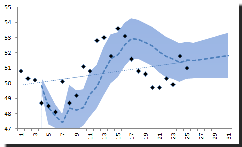
Notice:
The traditional trend line we draw using the whole sample does not give you any insight of how a linear trend works (or does not work) for your forecast.
2) Quadratic Trend
NxTrend supports polynomials of any order (assuming you have a good-sized data sample). So to generate a quadratic trend curve, we will set the order to 2.
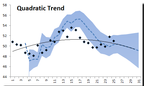
The quadratic curve does not look so bad: it forecasts a decline in sales after month 24. There are more points in the C.I. than in the linear trend we looked at earlier.
3) Logarithm Trend
Let’s assume the data follows the logarithm of time instead of time itself.
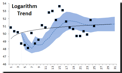
Obviously, the logarithm trend is inferior and does not describe the data well. Let’s toss it put that one to the side.
4) Exponential Trend
Using an exponential trend in Excel, we would like to believe that our data grows exponentially over-time. This may be appropriate for some types of data, such as population growth.
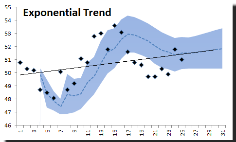
The exponential trend curve seems to do well throughout the sample.
5) Power Trend
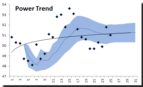
The power trend, on the other hand, provides a very poor fit.
Conclusion
The burning question now is: which trend function should I use for my forecast? My answer would be none, but if you must use one, we’d need to come up with a measure. Since we are focused on forecasting, we’ll use a measure to summarize the forecast errors generated during the back-testing:
- Ratio of the number of observations in the confidence interval band.
- Median - Robust measure of the forecast error distribution center.
- MAD - Robust measure of forecast error dispersion.

Again, the quadratic trend function did the best in our analysis, but its forecast error has a median of negative 0.9. To improve our forecast values, we can subtract 0.9 to whatever value the Quadratic trend function gives us. Here’s the new quadratic trend graph:
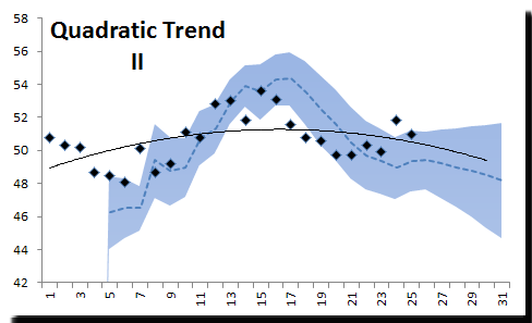
The dotted line in the figure above corresponds to the new forecast (with 0.9 subtracted). The solid line is the original trend function.
With this modification, 66.7% of the points are within the C.I. band.
Support Files
The PDF version of this issue can be found below:
Comments
Article is closed for comments.