This is the third entry in our regression analysis and modeling series. In this tutorial, we continue the analysis discussion we started earlier by leveraging a more advanced technique – influential data analysis - to help us improve the model, and, as a result, the reliability of the forecast.
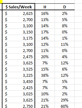
Again, we will use a sample data set gathered from 20 different salespersons. The regression model attempts to explain and predict the weekly sales for each person (dependent variable) using two explanatory variables: intelligence (IQ) and extroversion.
Data Preparation
Similar to what we did in our earlier tutorial, we organize our sample data by placing the value of each variable in a separate column and each observation in a separate row.
Next, we introduce the “mask.” The “mask” is a Boolean array (0,1) that chooses which variable is included (or excluded) in the analysis.
Initially, at the top of the table, let’s insert the mask cell’s array; each with a value of 1 (i.e. included). The array is shown below highlighted below:
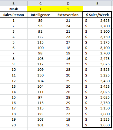
In this example, we have 20 observations and two independent (explanatory) variables. The response or dependent variable is the weekly sales.
Process
Now we are ready to conduct our regression analysis. First, select an empty cell in your worksheet where you wish the output to be generated, then locate and click on the regression icon in the NumXL
![]()
Now the Regression Wizard will appear.
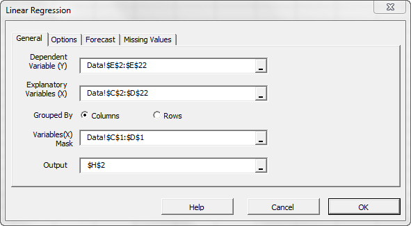
Select the cell range for the response/dependent variable values (i.e. weekly sales). Select the cell range for the explanatory (independent) variables values. For “Variables (X) Mask”, select the cells at the top of the data table (Boolean array).
Notes:
- The cells range includes (optional) the heading (“Label”) cell, which would be used in the output tables where it references those variables.
- The explanatory variables (i.e. X) are already grouped by columns (each column represents a variable), so we don’t need to change that.
- By default, the output cells range is set to the currently selected cell in your worksheet.
Please note that, once we select the X and Y cells range, the “options,” “Forecast” and “Missing Values” tabs become available (enabled).
Next, select the “Options” tab.
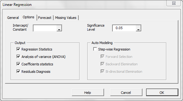
Initially, the tab is set to the following values:
- The regression intercept/constant is left blank. This indicates that the regression intercept will be estimated by the regression. To set the regression to a fixed value (e.g. zero (0)), enter it there.
- The significance level (aka. ) is set to 5%
- In the output section, the most common regression analysis is selected.
- For auto-modeling, check this option.
Now, click the “Missing Values” tab.
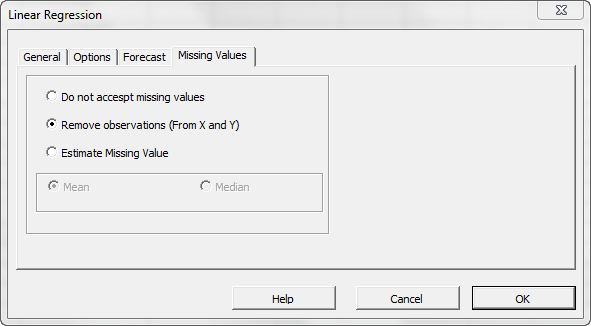
In this tab, you can select an approach to handle missing values in the data set (X and Y). By default, any missing value found in X or in Y in any observation would exclude the observation from the analysis.
This treatment is a good approach for our analysis, so let’s leave it unchanged.
Now, click “OK” to generate the output tables.
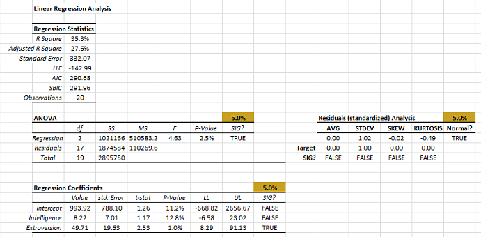
To assess the influence that each observation exerts on our model, we calculate a couple of statistical measures: leverage and Cooks distance.
- Select the cell next to the response variable.
- In the formula bar, type in the MLR_FITTED function, then click the “fx” button.
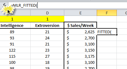
- The Function Wizard pops up. Select the input cells range, mask, and a Return type of 4 for the leverage statistics. Click “OK.”
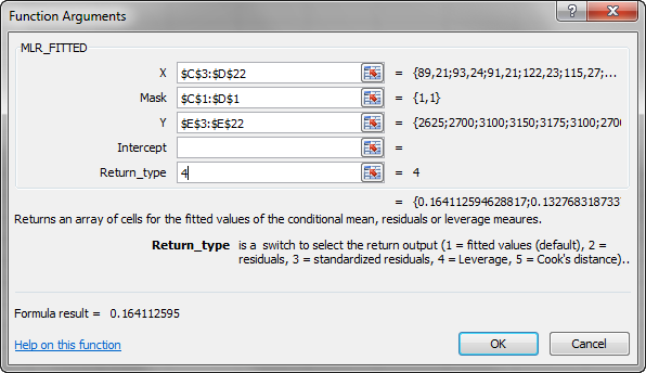
- MLR_FITTED returns an array of values, but you will initially only see the 1st value.
- To display the full array, select all the cells below (to the end of the sample). Press F2, then press CTRL+SHIFT+ENTER to copy the array formula.
- Now, to calculate the cook's distance, select the cell next to “Leverage” and repeat the same steps, but with the return type = 5.
Analysis
Now that we have the leverage and Cooks distance statistics, let’s interpret their findings.
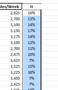
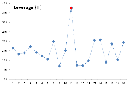
1.Leverage Statistics (H)
Leverage statistics measure the distance of an observation from the center of the data. In our example, the intelligence and extroversion values for Salesman 11 are furthest from the average. Does this mean Salesman 11 is an outlier? Does this mean he exerts influence on the calculation of the regression coefficient?
To examine this assumption, let’s remove Salesman 11 from our input data and examine the resulting regression. To do so, just insert an #N/A value in any input variable of this observation.
Dropping observation 11 made things at best the same as earlier. We opted to recover this observation back into the sample.
In sum, the leverage statistics do not necessarily imply an outlier, but merely a distant observation with few neighbors.
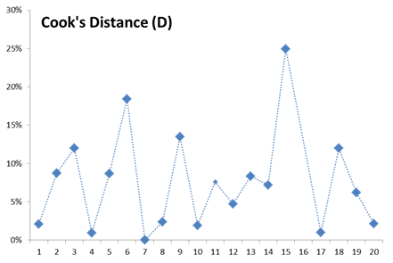
2. Cooks Distance (D)
The Cooks distance corrects for weakness in the leverage statistics and is thus more indicative of influential data. Furthermore, there are few heuristics for the threshold values of Cooks distance to detect an influential datum. For our analysis, we often use $\frac{4}{N}$ as a threshold (which translates to 20% for the 20 observations in our data set).
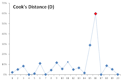
Using the threshold or just looking at the earlier plot, we detect that Salesman 16 exerts the highest influence on our regression, so let’s void this observation (by setting #N/A in one of the input variables).
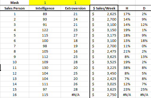
Note that the leverage statistics and Cooks distance return #N/A for this missing value.
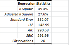
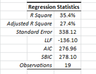
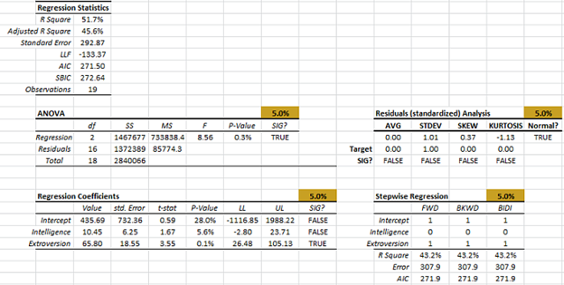
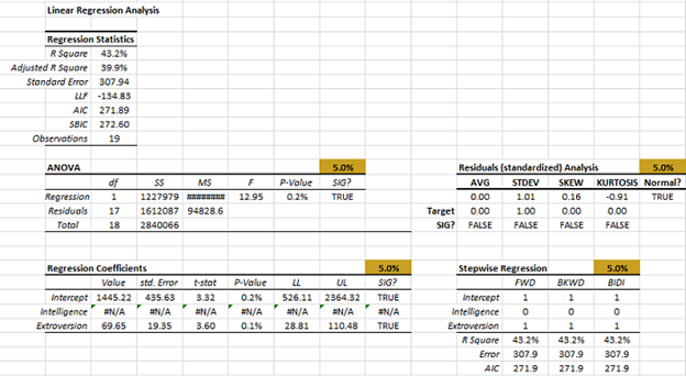
Let’s now examine the regression statistics before and after we dropped the sixteenth observation.

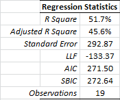
As you may already have noticed, the regression improved significantly on every dimension (e.g. R square, std error, etc.). Salesman #16 seems to be an influential outlier, so we’ll drop him.
To help explain what makes an observation influential, let’s examine the extroversion vs. weekly sales graph below:
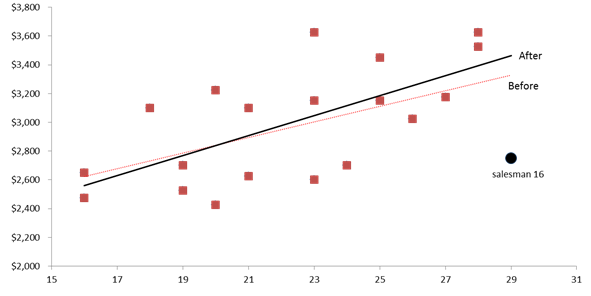
We draw the linear trend as a proxy for our regression model. The black (circle) data point represents Salesman 16. Its location (extroversion and weekly sales value) is pulling the regression (dashed) line toward it, affecting the value of the regression slope and intercept.
Dropping this observation releases the regression line, adjusting it to better fit the remaining points.
Let’s take another look at the Cooks distance plot (without Salesman 16, and with a threshold of \frac{4}{19}=21%)
The Cooks distance values for the different plots are distributed somewhat uniformly, and we may stop there.
Note:
Bear in mind that our threshold rule is merely a heuristic (rule of thumb), and should not be taken rigidly, but rather as a guideline.
Conclusion
In this tutorial, we have shown that excluding observation #16 is beneficial to our modeling efforts as it exerts a significant influence on our coefficient calculation.
Next, using the remaining 19 observations, let’s recalculate (SHIFT+F9) the regression statistics, ANOVA, residuals diagnosis, stepwise regression, etc.
The optimal set of the input variables is the same as earlier. Let’s drop the “intelligence” variable (by setting its value to 0 in the mask), and recalculate.
The regression error is \$307 (vs. \$332 before we removed salesman #16).
The final question we may ask ourselves; Is the regression stable over the sample data set? Next issue.
Comments
Article is closed for comments.